Tuesday 24 April 2012
Friday 20 April 2012
Type and architecture
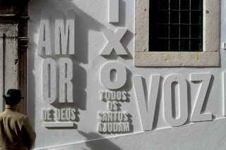
Project by Garth Walker
One of his public projects—intensely personal nonetheless—is the typeface and signage at the Constitutional Court complex in Johannesburg. He described wandering around three abandoned apartheid prisons on the site where the court was to be built and photographing all kinds of lettering: crude notice boards, “whites only” signs, and graffiti etched into the dirt walls of cell blocks where political prisoners had been held. “I had lettering from both the captives and their captors,” he said. Beginning with a loopy ‘B’ based on the handwriting of a court justice, he selected individual letterforms from the various artifacts and incorporated them into the typeface. In 2004, the words “Constitutional Court” in South Africa’s eleven official languages were fabricated in 3-D acrylic in Walker’s “Prison Font” in the colors of the South African flag.
Garth Walker: “This was my contribution to the ideals of a nation of truth, dignity and freedom,” Walker asserted, “in a place that was once a bastion of incarceration, torture and repression.”
http://goo.gl/V5sRn
Thursday 19 April 2012
Typography is more than just print
As part of their final school project, design graduates Joseph Egan and Hunter Thompson created anamorphic typography installations that appear to float in mid air.
Meant to explore the “relationship between architecture and graphic design”, according to Egan, these large slogans are only legible from a certain angle.
The ‘It’s More Than Just Print’ work is especially astounding, looking like a Photoshopped image rather than something you could actually step into.
http://designtaxi.com/news/32655/Anamorphic-Typography-Plays-with-Architecture/
BuildMe
Hey blogger fans, new theme: Typography meets Architecture. There is
actually a term for this, typotecture. The collaboration of the two
worlds lends inspiration that go both ways. Architects get inspiration
for typographers & typographers get inspiration form architects.

Monday 16 April 2012
Dana Tanamachi
Graphic designer Dana Tanamachi moved from Texas to Brooklyn to design Broadway show posters and has since become so well known for her custom chalk lettering that it is now her full time job. She has been commissioned by clients such as Oprah, Gwyneth Paltrow, West Elm (where she has a line of paperweights), Rugby Ralph Lauren, Google, The Ace Hotel, Adidas, EveryDay with Rachael Ray, Lululemon Athletica, and Garden & Gun Magazine.
http://www.danatanamachi.com/
http://www.danatanamachi.com/
Sunday 15 April 2012
Chalk designs
Chalk designs has made his way back in the design world with the whole vintage revival! Chalk designs has a handmade/home'y feel to its. Loving it!
Wednesday 11 April 2012
Laura Varsky
Laura Varsky is a graphic designer and illustrator from Buenos Aires, Argentina.
Her first forays into the design world came through her involvement with the local independent rock scene. After 10-year professorship in Typography at the School of Design of the University of Buenos Aires, she continues coordinating worshops and giving lectures extensively throughout Latin America and Spain.
http://www.lauravarsky.com.ar/about-laura/
Subscribe to:
Posts (Atom)


